Wednesday, December 7, 2011

Star Diffusion Effect

The Star Diffusion effect can be created to every photo using Photoshop. The Star Diffusion is a technique used to focus on the main subject of the photo. It creates a four point star blur in the background of the main focus. In our photo of the student parading down the hallway, we used it to create a main focus on the student and less focus on the background or the rest of the hallway. These are the steps to create a Star Diffusion:
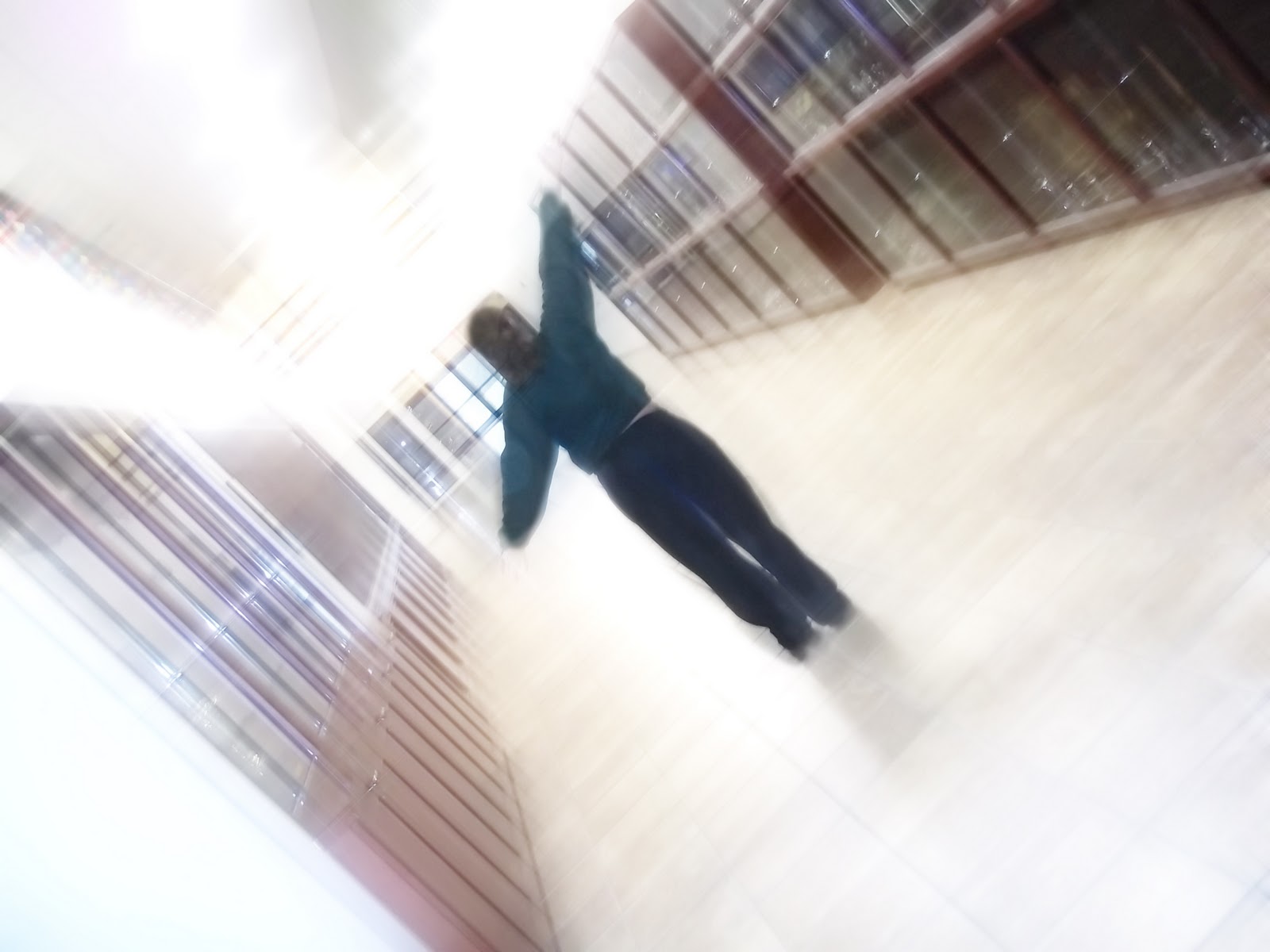
before

1.       Open an image on photoshop
2.       Go to the layer and click duplicate layer
a.       When a box pops up press ok
3.       Repeat step two again
4.       Click on top layer
5.       Click on filter
6.       Choose blur
7.       Then motion blur
8.       Change the angle to 45 degrees
9.       Change the distance to the 200 or whenever you can start to see stars forming in the background
10.   Press ok
11.   Turn off first layer (press the eye ball)
12.   Go to the second layer
13.   Go filter
14.   Choose blur
15.   Then choose motion blur
16.   Change the angle to -45 degrees
17.   Change distance to 200 or whenever you can start to see stars forming in the background
18.   Press ok
19.   Choose top layer
20.   Go to the blend mode Change  it to screen
21.   Go to layer
22.   Press merge down
23.   Change the blend mode to screen
24.   Go to image
25.   Then adjustment
26.   Then levels
27.   change the levels to where it begins to look right
28.   Take the eraser tool
29.    drop the opacity down to 30-50
30.   Erase the focus image where it is necessary
31.   Flatten image and save as a jpeg

after

Tuesday, November 29, 2011

Softball Advertisement

In the advertisement above, I created it using Photoshop. I made it like this because it invites everyone to come out and support their Mercy Jags. I created this advertisement using several tools. I used the textbox tool so I could put the text on the advertisement. I had to select the pictures on the advertisement and copy and paste them on to the advertisement. In order for me to make the softball, I used the shape tool to make the ball. To make the lines I had to use the line tool as well as the pin tool to curve the lines the way I wanted them to. For the red seams on the black lines, I decreased the opacity as well as using the eraser tool to help shape the lines. To make the red seams however, I used the paintbrush tool.On the picture of the softball field, I had to crop the photo. In order for the background to be blue, Mercy's school color, I used the fill tool which filled in the entire background. To get my logo in the bottom right corner, I used the lasso tool and then copy and pasted the logo where I wanted it to go. The pictures of the jaguar and the rocket are there to represent the mascots of each team. I enjoyed this project and liked creating my own logo as well as my own advertisement.

Tuesday, November 15, 2011

Creating a Logo

The logo I chose to create was for a softball team. It relates to the purpose of it because it has a field as well as a bat to go along with it. I shaped the field to make it look like a softball with lines on it like a softball would have with a bat hitting it, which illustrates what happens during the game of softball. I have the name of the team writen inside of the bat so people know what team the logo is for.
I chose the colors, green and brown, because that is what colors are found on softball fields. I made the bat black so it would go with the field and lettering. In my logo, I used several elements in Photoshop. I used the line tool to help make the field so it was as close to perfect as I could make it. I aslo used the pin tool to help make the cruve where the outfield would be on the softball field. Another tool I used was the paint tool. I used the painting tool a lot to paint in the colors on the field.

Thursday, October 27, 2011

Before & After Photoshop

Before


In order for me to change the before picture to the after, I had to use several tools in Photoshop. The overall transform of the picture was verydifficult. At times, it was hard to determine the correct skin color as well as how to place my face on the photo of Julianne Hough. Once I finished the photo, I feel good about the outcome. This makes me realize just how much photos in magazines can be editted and transformed into someone who looks nothing like the original person. This shows me how much people care about looking "perfect". People today are willing to do anything just to have a "perfect body" image. I think in this project, I did a good job fitting the face on my "after" picture. I also feel like I did well on blending my skin color to match the one of the other photo. I think I could have done a better job editting my face to make it look more realistic. I also feel like the makeup I used on my eyes could have been lighter to look more realistic. Overall, I really enjoyed the project and learned a lot about Photoshop.


Tuesday, October 11, 2011

A Day in the Life...

This collage shows what a day in the life of a Mercy student is like. I have edited these photos in photoshop to fit the coloring, size, and other effects. In two of my pictures, I have changed the color from the original to black & white. In the picture of the girl at her locker and the picture of the classroom, I have edited the exposure and saturation. In nearly all of my pictures, I used the cropping tool and in a few, I rotated them to look better. In the picture of the lockers, I changed the color balance so the light looked better in the picture. In that picture, I also used an element of photography, balance. I also showed balance in the picture of the classroom by the angle I took the picture. In the two pictures at the bottom left and bottom center, I showed simplicity.

Sunday, September 25, 2011

Photography

This image shows "simplicity". The picture is very simple and easy to see and understand. Not many things are included in this picture, which makes the picture easy and simple to understand.
This image is an example of "framing". The picture is framed around the fireplace. The outline of the picture adds more to the picture.
This image is an example of "balance". The mirror is balanced between the two lamps, adding more frame and shape to the picture.

Thursday, September 15, 2011

Podcast & Piracy

In our podcast, all of our work is our original work. However, we did use picnik.com to edit our picture for our podcast. That website is okay to use because it is public domain and is on the Internet for anyone to use. All the website does is allow people to edit their pictures.
    In some cases, downloading music can be wrong, but in other cases, it is perfectly okay to do. If someone downloads music without paying for it fist, then it is illegal. However, if they pay for the songs they download it is okay, Unless, they download the songs and make a CD for their friends. No one can buy music and share it with others who have not paid for that music. I think copyright laws should exist. Every time someone takes a song without paying for it first, they take away more than they think. They take away from the artist along with everyone involved in that music company. Artists around the world lose money due to people taking their music. Piracy is so prevalent in our society because it takes away so much from people, and with today’s economy, people really can not afford that. Piracy causes more and more people to lose money every year.
    If someone were to use either my graphic or podcast without first getting my permission, I would not like that at all. As a group in class, we worked very hard on everything we did. If someone was to take that without giving us credit or asking us first, it would not be fair to us. If someone wants a podcast or graphic of their own, they can make one themselves, they do not have to take away from other people.


Item Thumbnail